RSA Project
DM2128: Individual RSA Project
Project Overview
This project, aligned with RSA brief "Creative Communities" (RSA Spark, 2024), focuses on creating a community where everyone can access art and culture engagement from everywhere, and people who are creative jobs can find more opportunities and earn a sustainable income more easily. I focus on traditional crafts community, and my project is creating an App for traditional crafts, also helps designers.
Problems
Few people are aware that many traditional crafts are listed on the Red List of Endangered Crafts, which identifies traditional crafts at risk of extinction. There are different types of traditional crafts, including tools, clothing and performing arts. According to HERITAGE CRAFTS (N/A), the list are increased.
There are some reasons why traditional crafts are under the threat of extinction. The reasons include a lack of engagement from younger generations and the limited adaptation of traditional crafts to the digitalised world. Most traditional craftspeople are older generations and tend to avoid using digital devices in their daily lives. Many elderly struggle with digital devices because there are not designed for individuals who are unfamiliar with technology (Jolanki et al, 2020:5). While digitalisation improves the convenience of daily life and facilitates stronger connections with society, elderly individuals must overcome digital barriers to fully access these benefits.
The Brief
Create a prototype App for traditional craftspeople and designers that allows them to have marketplace, collaboration forum, promotion tools, and education and resources of traditional crafts.
Process
My research will be focus on the digital barriers faced by the elderly and people who are not familiar with the digital devices. Also, I discover how to connect the elderly to the digital community, and help designers to promote their works as well.
Solution
I discover how to connect the elderly to the digital community, and help designers to promote their works.
SDGs
This project is related to the twelfth SDGs (Sustainable Development Goals), responsible consumption and production (The Global Goals, 2024). Some traditional crafts are environmentally friendly, such as clothing made from plants. Through using that technology and promoting such products, there is the possibility to create more items that can return to nature.
Aim and Objectives
Aim 1: To learn about the elderly with technology barriers.
Objective:
To understand the RSA brief, and identify common usability problems faced by the elderly in mobile apps, focusing on readability, input methods, and navigation.
Aim 2: To explore and enhance mobile app interface design, ensuring usability, accessibility, and inclusivity for the elderly.
Objectives:
1: Enhance readability
To explore the impact of font style, size and colour on readability for the elderly, including accessibility standards to improve text clarity and reduce visual discomfort.
2: Refine information architecture
To develop an information architecture that prioritizes clarity and minimizes decision fatigue for the elderly, ensuring that content is logically grouped and easy to discover in the mobile app.
3: Optimise navigation
To analyse and design instinctive navigation patterns for mobile apps, focusing on reasonable load and simplifying multi-step processes for the elderly. This includes evaluating gestures, layout, and menu structures to ensure usability.
Aim 3: To test my ideas and to see if my solution is viable.
Objective:
To propose practical recommendations, informed by research and initial prototyping, for the development of a mobile app that bridges the gap between the older community and designers, fostering collaboration and creativity in response to the RSA brief.
Initial Ideas
Project Research
Key Concepts
From primary research, I devolved into the knowledge of digital barriers for the elderly.
- Readability: Readability focuses on how easily to read the texts and content. This includes font, font size, and colour combination.
- Information architecture: Information architecture focuses on how to make the content more accessible and easier to understand. This includes icons and layout.
- Optimased navigation: Effective navigation is crucial in guiding users clearly and intuitively. This includes navigation bar and scroll system.
Research and Survey
This survey was administered via Google Forms as an A/B test. It involved presenting several design styles and interface mock-ups, with participants asked to choose the ones they regarded as most readable and user-friendly. The target audience is the elderly, but the survey was conducted across all age groups, with the condition that age was included as a question. It also inquired about their proficiency with digital devices. Thus, this approach enables the collection of a broader range of opinions including those from elderly individuals and individuals who are not familiar with using technology.
Readability
Font
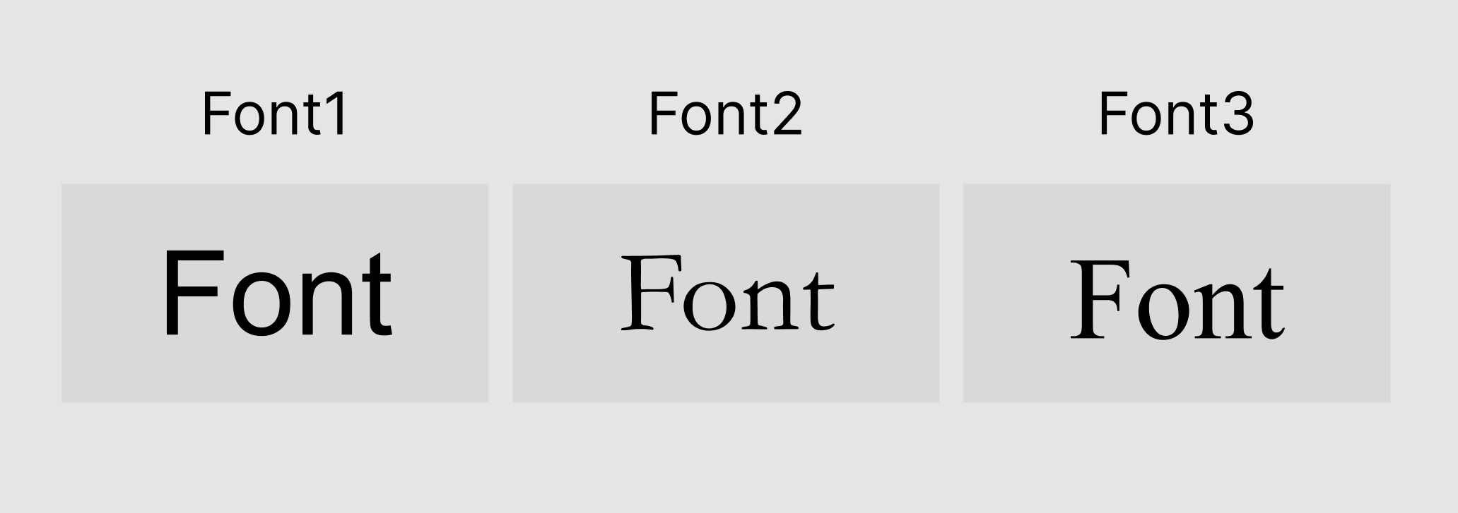
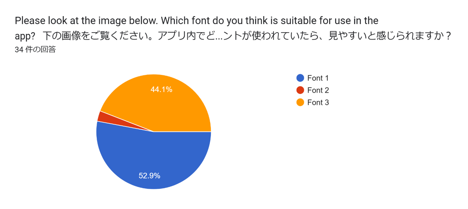
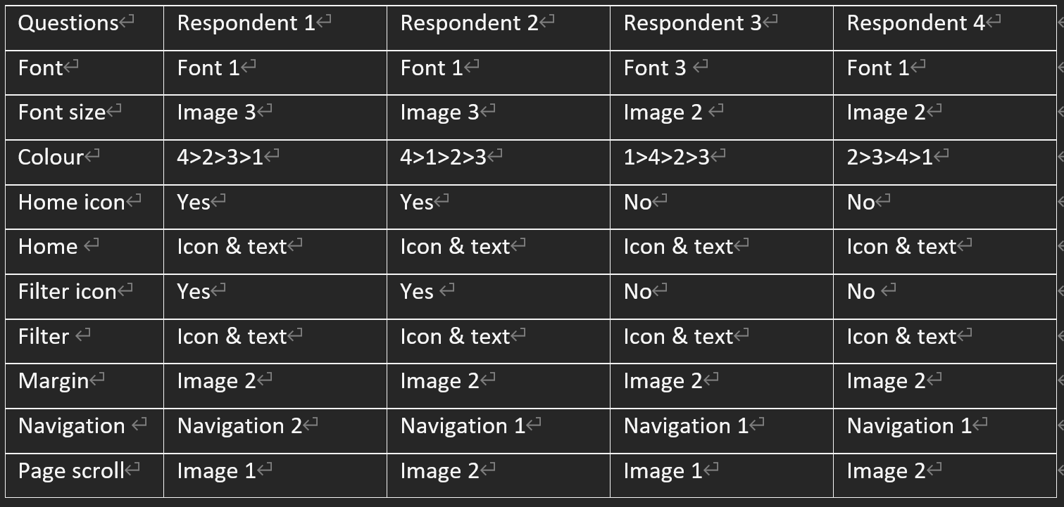
In my research, sans-serif fonts are the most legible because they vacant additional strokes (Adchitects, 2024), so it compared sans-serif fonts with other font styles. It showed one sans-serif font, "Arial", and two non-sans-serif fonts, namely "Times New Roman" and "Garamond". Respondents were presented with these three fonts and asked to choose the one they considered most readable.
While many participants perceived Arial, a sans-serif font, as the most readable, the difference was not substantial, with a significant number also selecting Garamond, a serif font, as their preference. Moreover, very few participants chose Times New Rowan compared to the other two fonts. The difference between Arial and Garamond, as compared to Times New Rowan, can be attributed to the variations in font weight. Times New Rowan is a thinner font than the other two. It can be inferred that many respondents considered not only the readability of the font but also the thickness of the font when making their comparisons. Based on these findings, it is suggested that font thickness is more important than whether the font is sans-serif or serif in terms of readability.
Font size
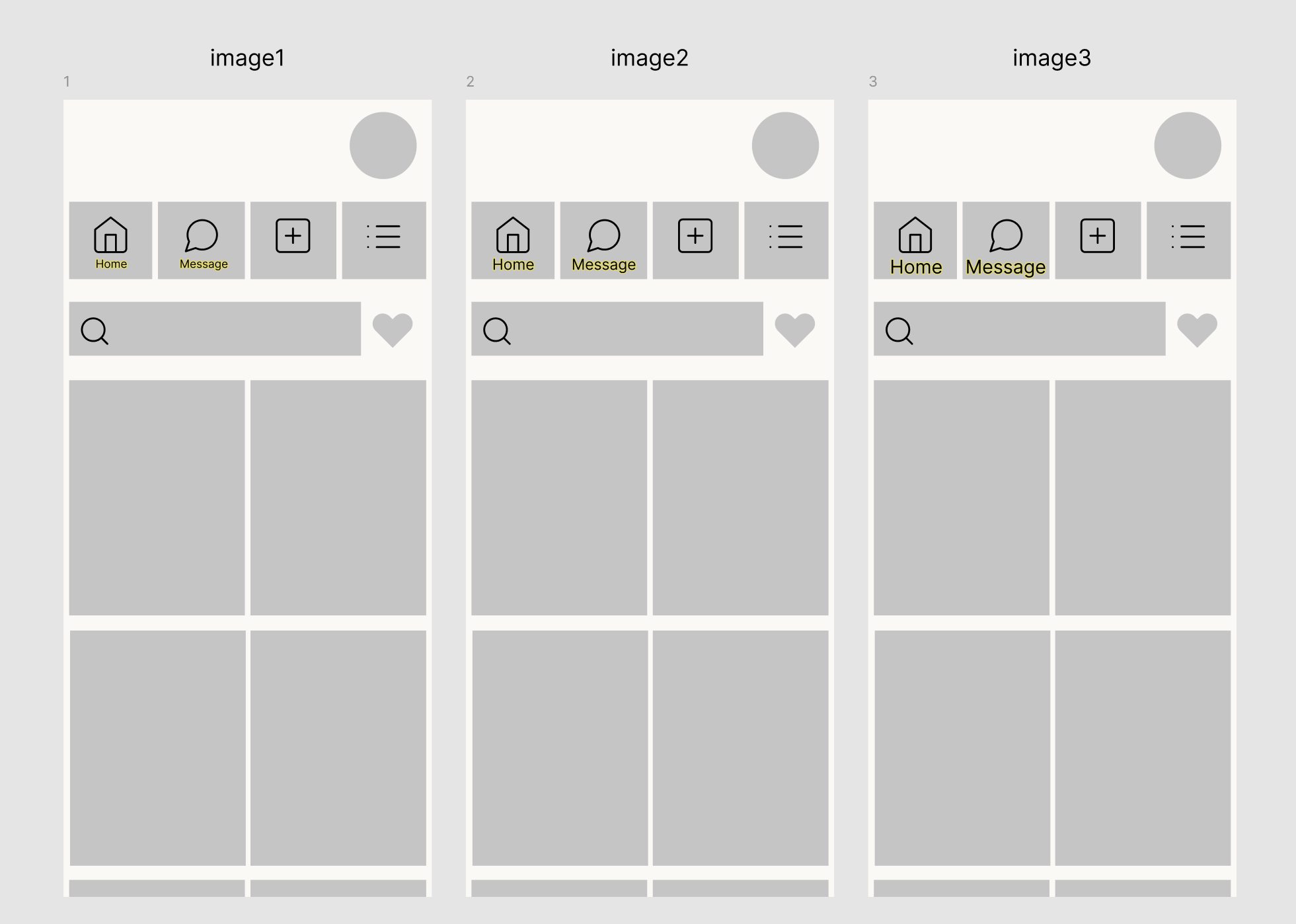
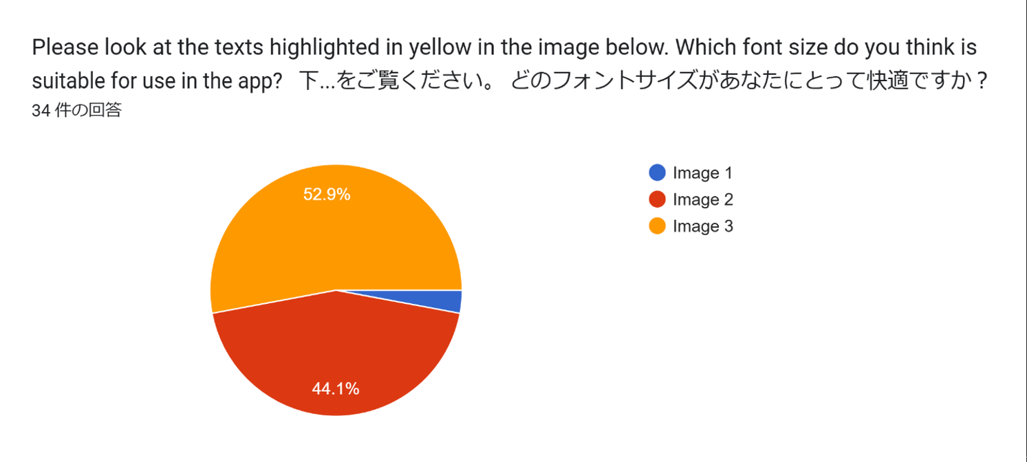
It addressed font sizes. According to Adcgitects, 2024), the most appropriate font size is considered to be 16px. In this study, a 16px font, along with 12px (smaller) and 20px (larger) fonts, were displayed within an interface and compared for evaluation.
The selection of fonts in the 16px or 20px range by many respondents suggests, as indicated in the data, that font sizes 16px or larger are preferred.
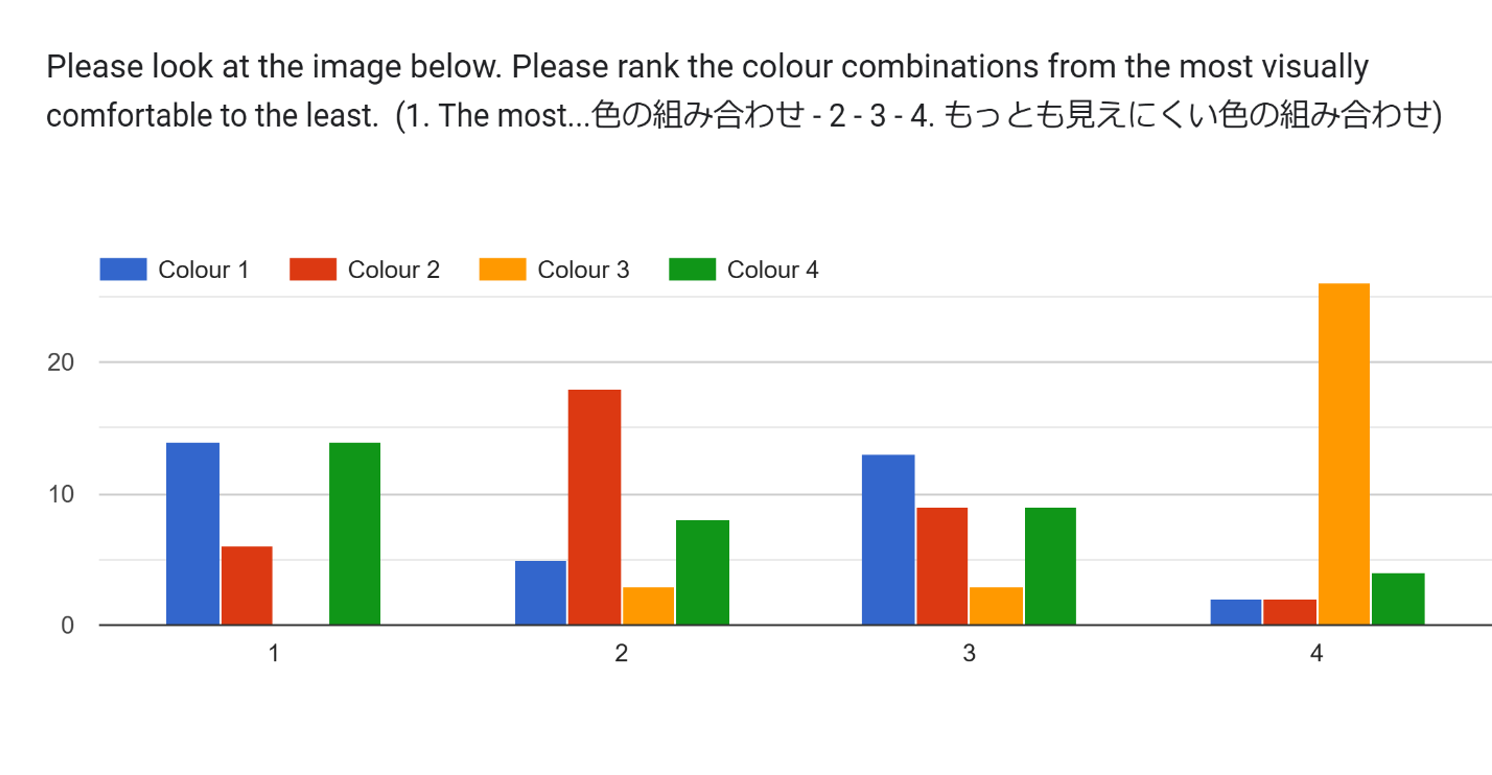
Colour theme
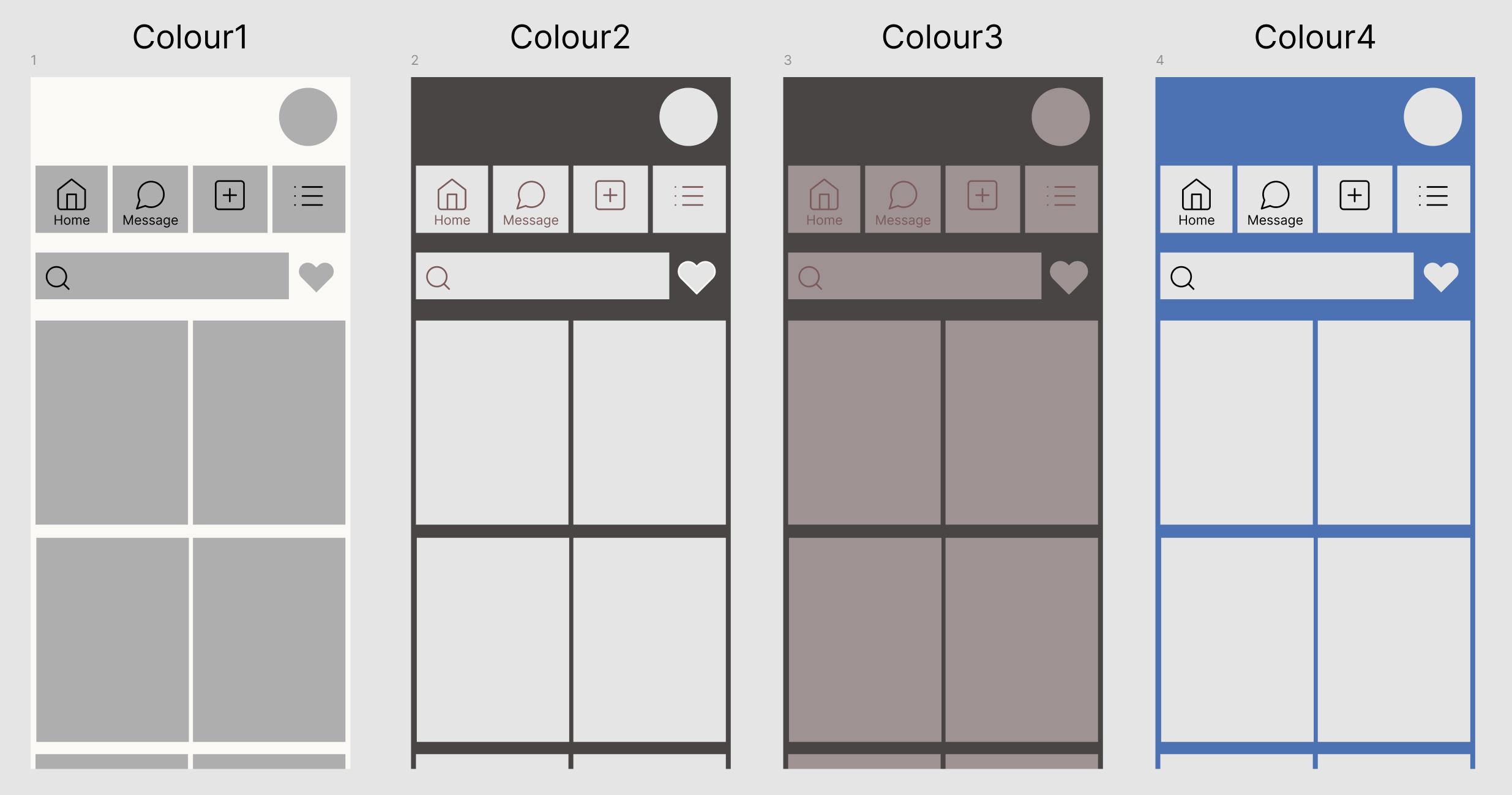
To emphasise the significance of contrast in app design, the study evaluated carious colour-themed interfaces. These included one featuring monochrome contrast, one utilising non-monochrome contrast, one lacking any contrast, and one with a blue background, as ensuring blue elements have been shown to diminish the effectiveness of contrast (Kasym, 2024). In this question, participants were instructed to rank the interfaces based on visual comfort, ranging from the most visually comfortable (ranked as 1) to the least visually comfortable (ranked as 4).
The results of the colour combination clearly demonstrate that contrast is crucial, as no participants selected an interface with low contrast as the most readable colour theme, while a significant majority identified it as the least readable. One point of concern, however, is that the results did not suggest that blue elements reduce contrast visibility.
Information Achitecture
Icons
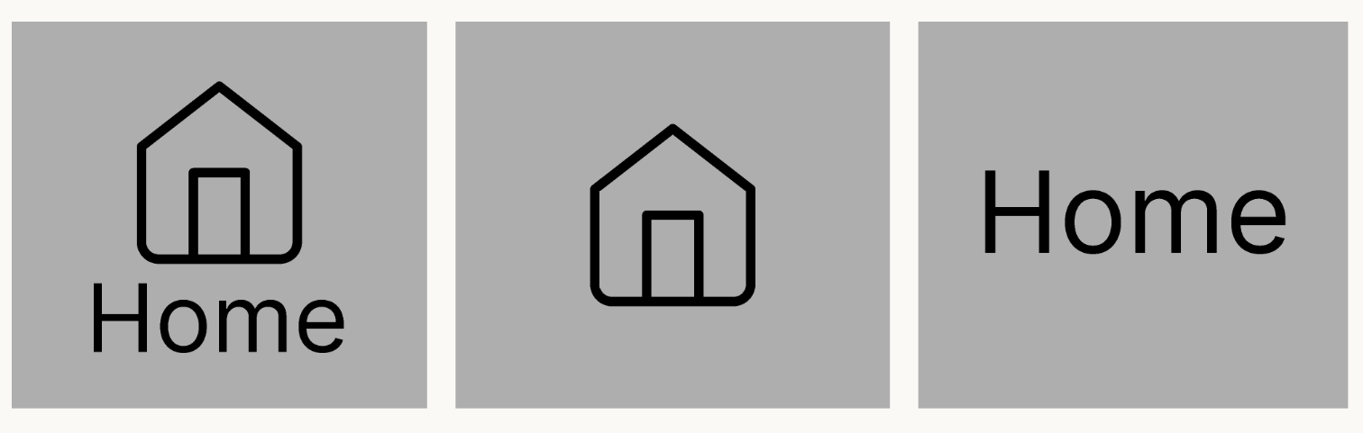
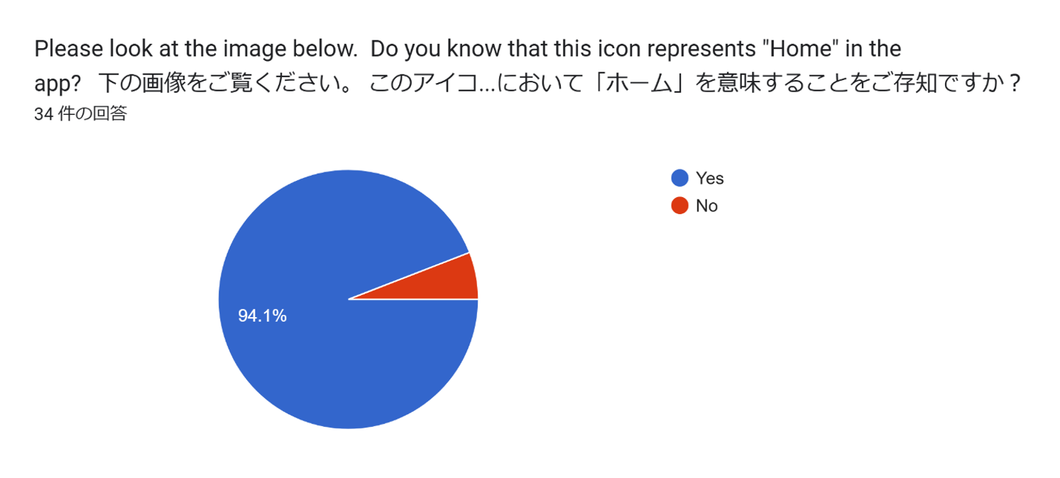
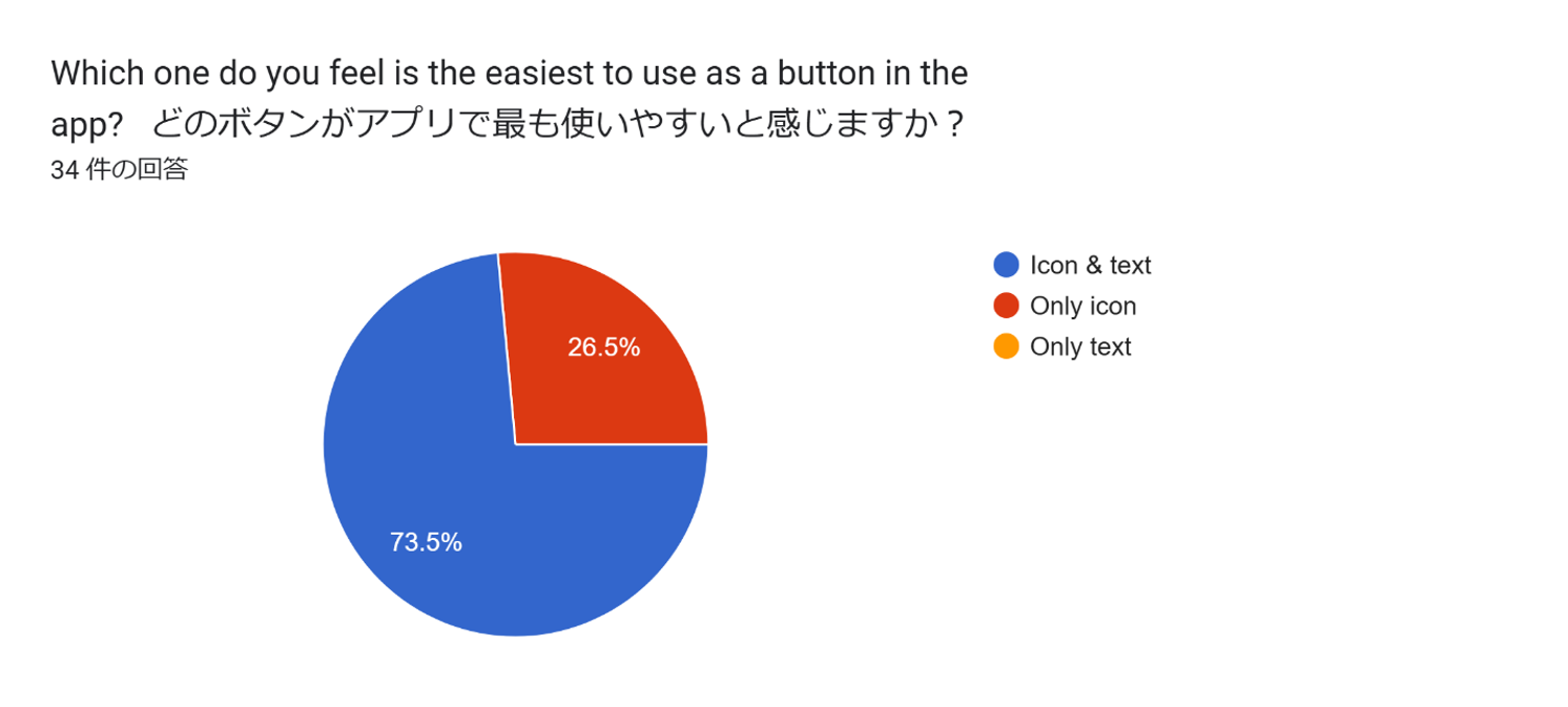
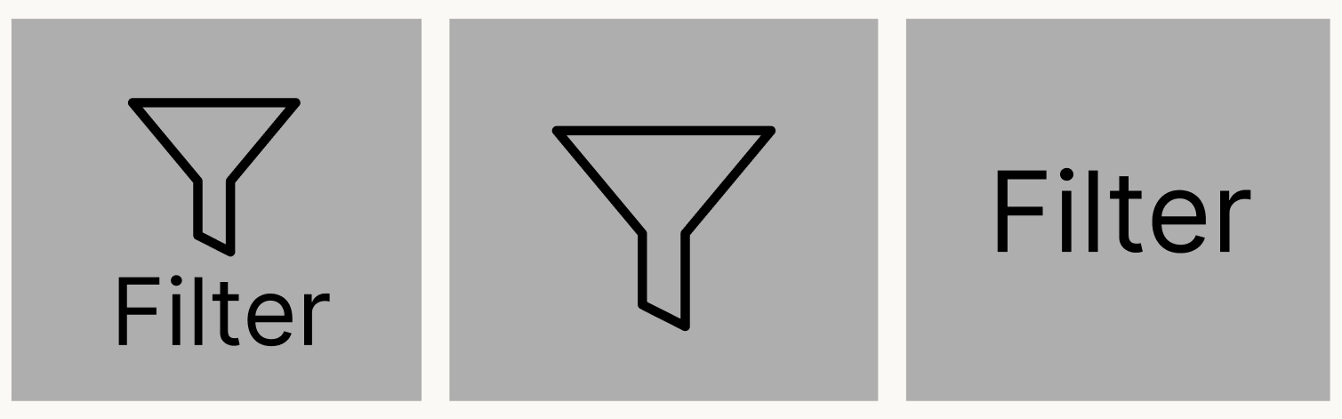
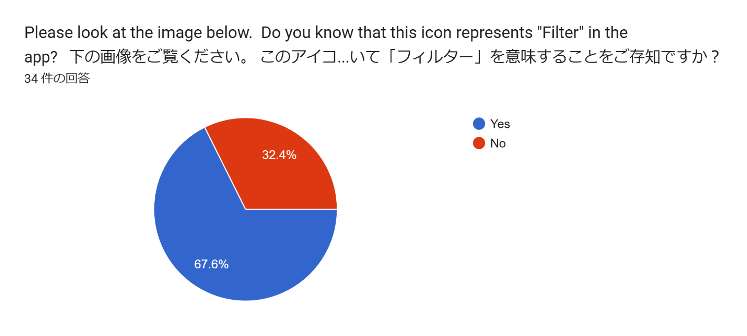
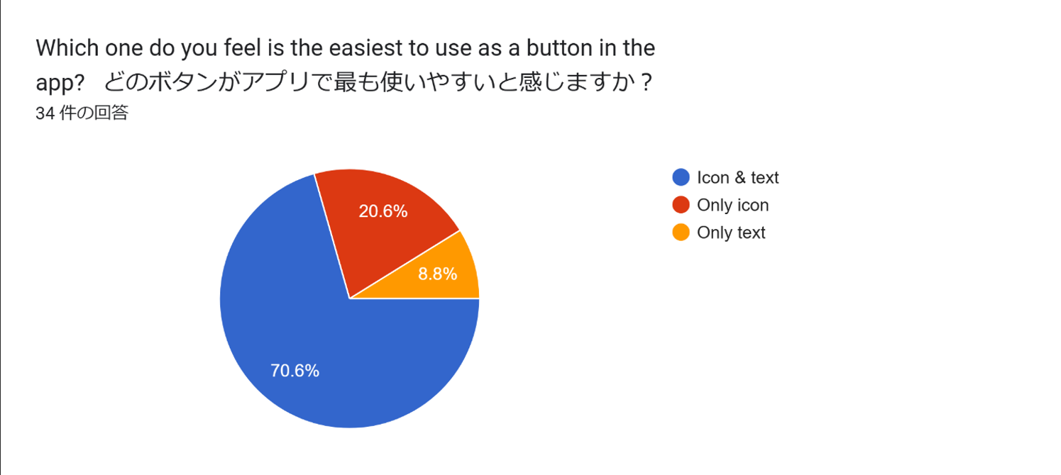
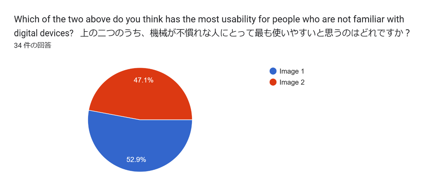
Icons are expected to be instantly recognisable, but their clarity varies. For instance, home and arrow icons are intuitive due to their clear design, while settings and filter icons can be less identifiable. Additionally, individuals with limited digital experience may struggle to understand an icon’s role, even if its meaning is visually clear. The survey compared the recognisability of the home and filter icons, asking participants to choose between icon with text, icon only, or text only. Results highlight that not all icons are universally clear and their effectiveness improves when paired with text.
The results regarding icons suggest that, even when visually clear, icons may not always be understood in terms of their functional role within the app, as demonstrated by the home icon, some participants were unaware that it serves the function of navigating to the home screen within the app. Additionally, while many participants preferred displaying text alongside icons, some suggested that text-only buttons would be acceptable for icons that were visually unclear, as some participants noted, text-only buttons would be more user-friendly for the filter icon in the study.
Layout
In terms of layout, each element is recommended to be large and simple, and the margins between elements should be adequate spaces (Polyuk, N/A). Each element is distinctively separated, ensuring that all elements are clearly legible and more easily accessible. Participants were asked about the width of the margins between each element. The margins were displayed in three levels, one with a very small margin, and the other two with gradually wider margins. They selected the option they found most visually comfortable from those three.
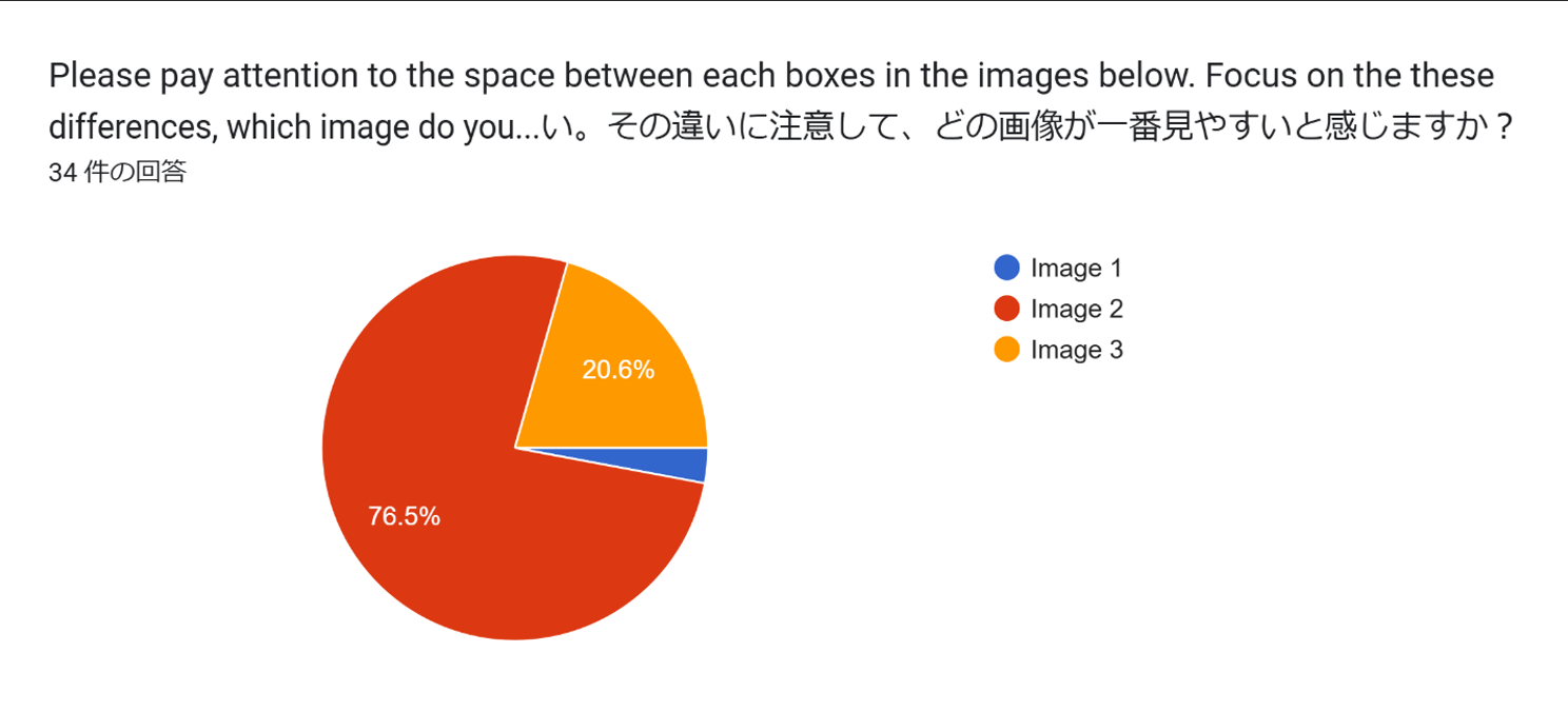
Approximately three-quarters of the participants selected the design with the second widest margins. This implies that the space between each element should be neither too narrow nor too wide.
Navigation systems
Targeted audiences' results
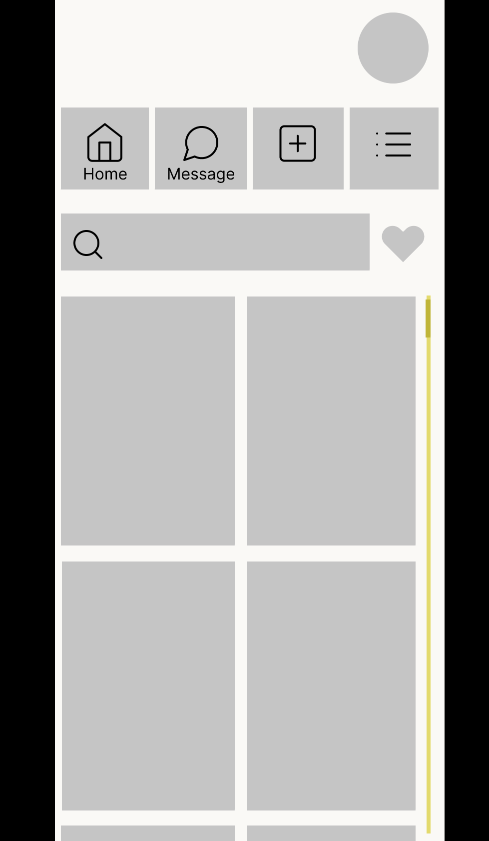
Navigation bar
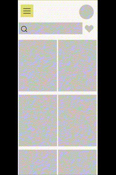
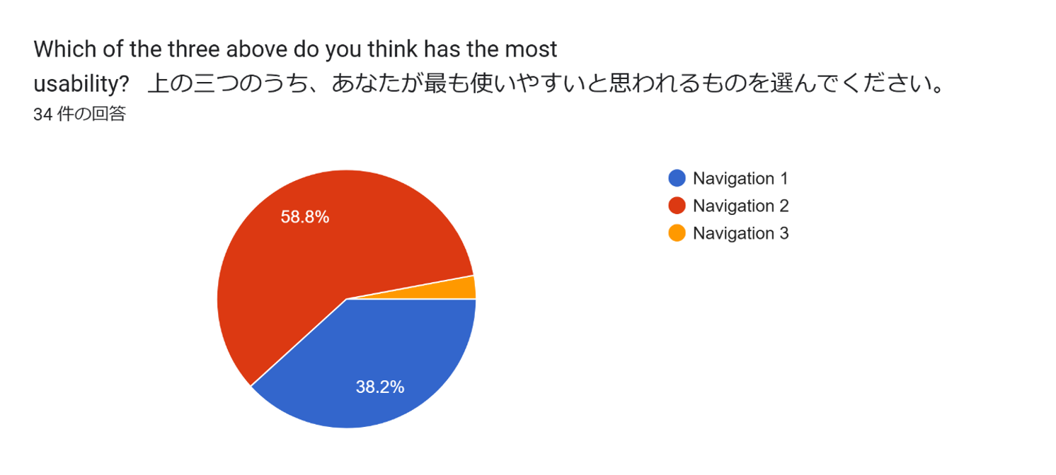
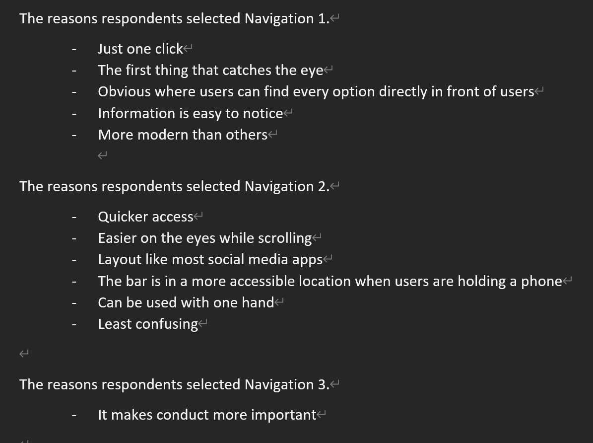
The study required participants to identify the most usable navigation system and to explain the reasons for their choices. In the study, three types of navigation bars were presented as moving images. Each navigation bar had a different position, and one of them functioned differently.
The low selection of Navigation 3 stems from feedback that its collapsed state makes the navigation bar hard to locate. While it prioritizes other elements, this design is unsuitable for older adults or those unfamiliar with digital devices. Navigation 1 was chosen slightly less than Navigation 2, with their main difference being the bar’s position—top or bottom of the screen. Both were deemed user-friendly and similar to common apps. Navigation 1’s advantage lies in its placement within the user’s line of sight, aiding focus, while Navigation 2 supports one-handed use. Among the target audience, three out of four participants found Navigation 1 easiest, citing its visibility and ease of navigation. Additionally, individuals less familiar with devices are unlikely to use a smartphone one-handed. Eye-tracking studies also show users naturally focus on the top of the screen (CursorUp, N/A), making Navigation 1 more suitable for older and less tech-savvy users.
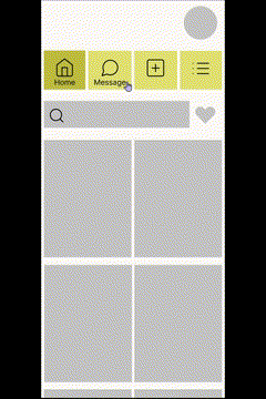
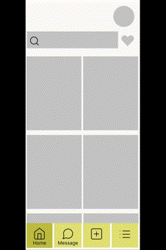
Scroll systems
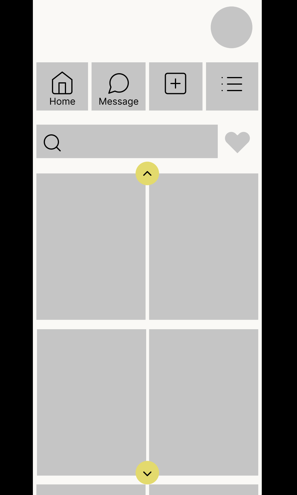
This survey also conducted scoll systems. It compared swipe-type scoll (image 1) and tap-type scroll (image 2).
Both options exhibited comparable strengths and weaknesses. For instance, Image 1 is intuitive and easy to use, with its elements positioned unobtrusively and allowing for easy navigation back to previous content. However, it has the potential to confuse users who are unfamiliar with the swipe functionality. Then, Image 2 offers clear functionality through the inclusion of arrows, making its use intuitive, and its tap-based design ensures ease of operation. However, it poses a risk of unintended actions, such as accessing incorrect content due to accidental taps or excessive pressure. These findings indicate the necessity of exploring a more effective scrolling function that integrates the strengths of these features.
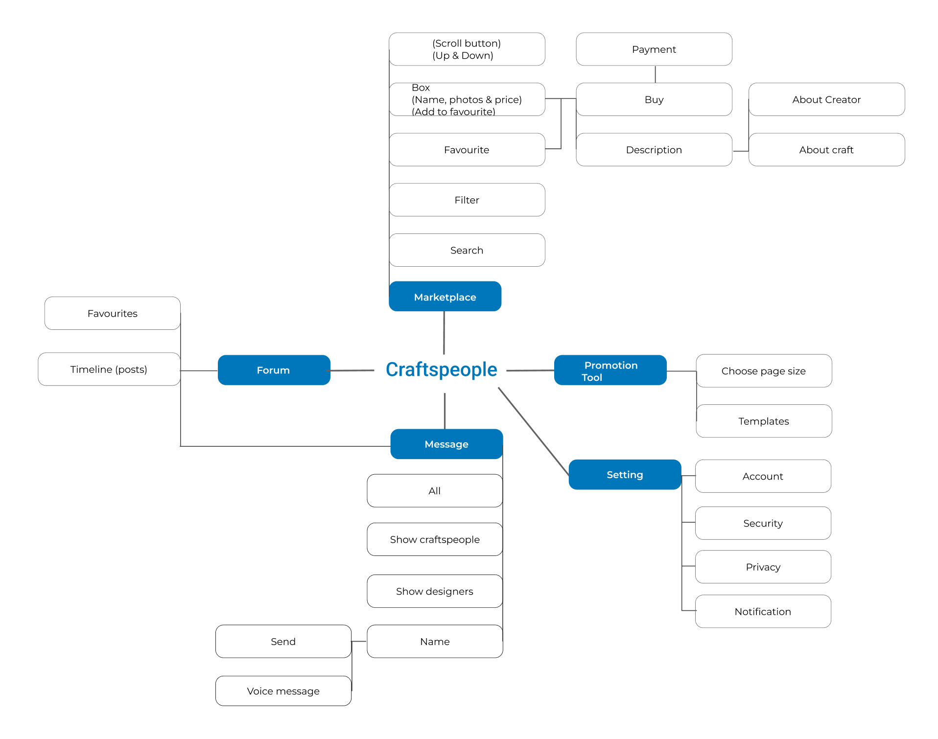
Site Mapping
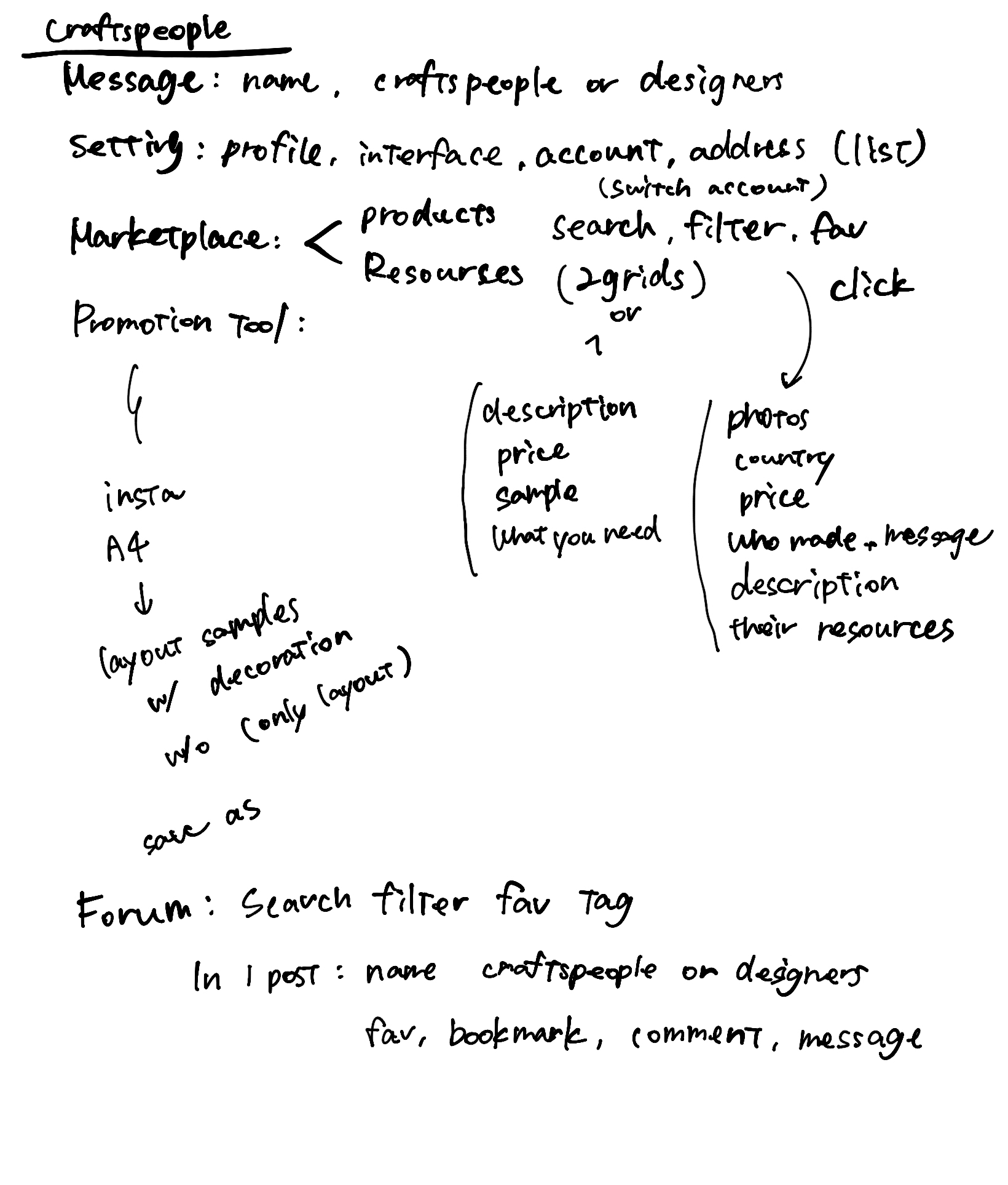
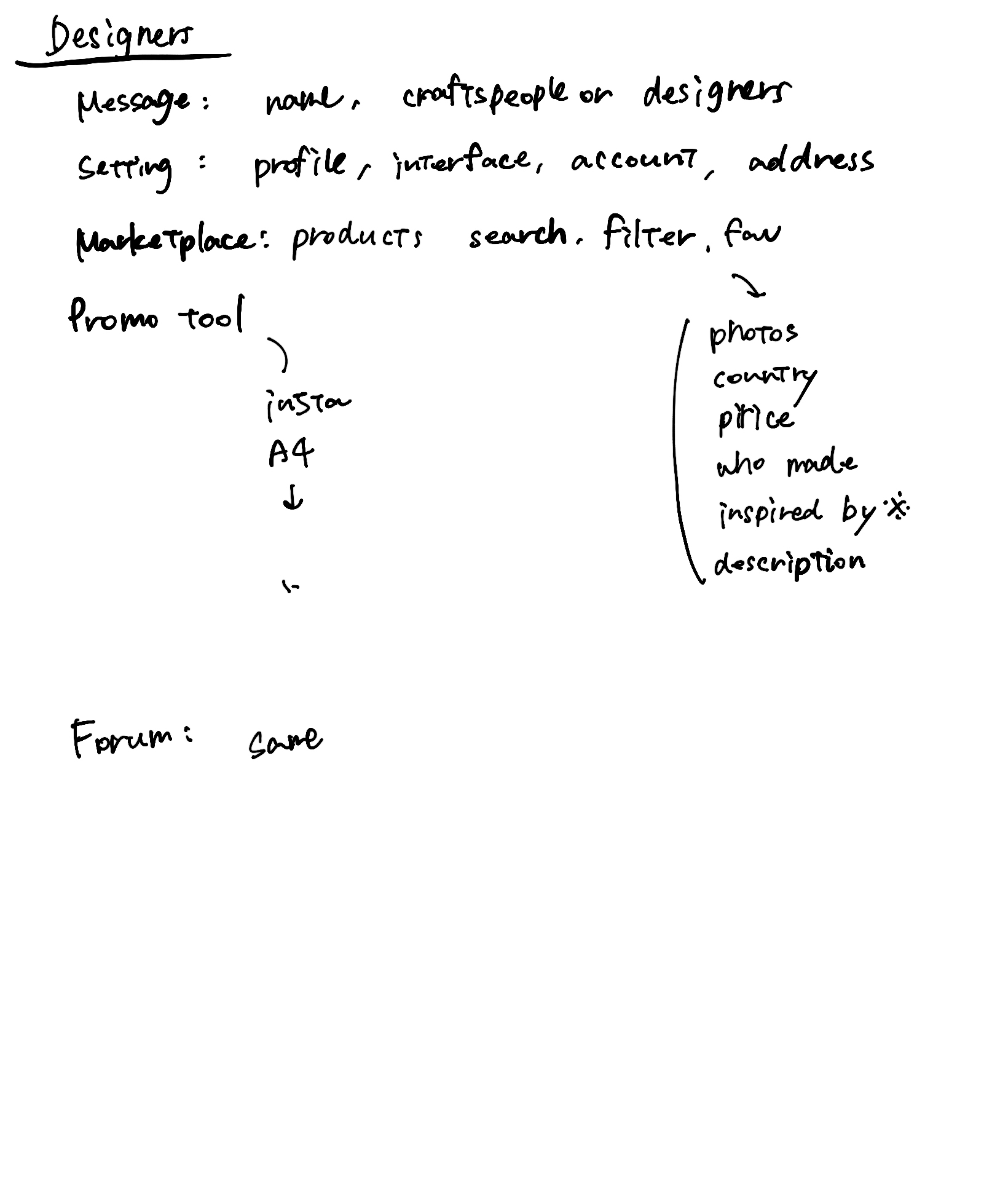
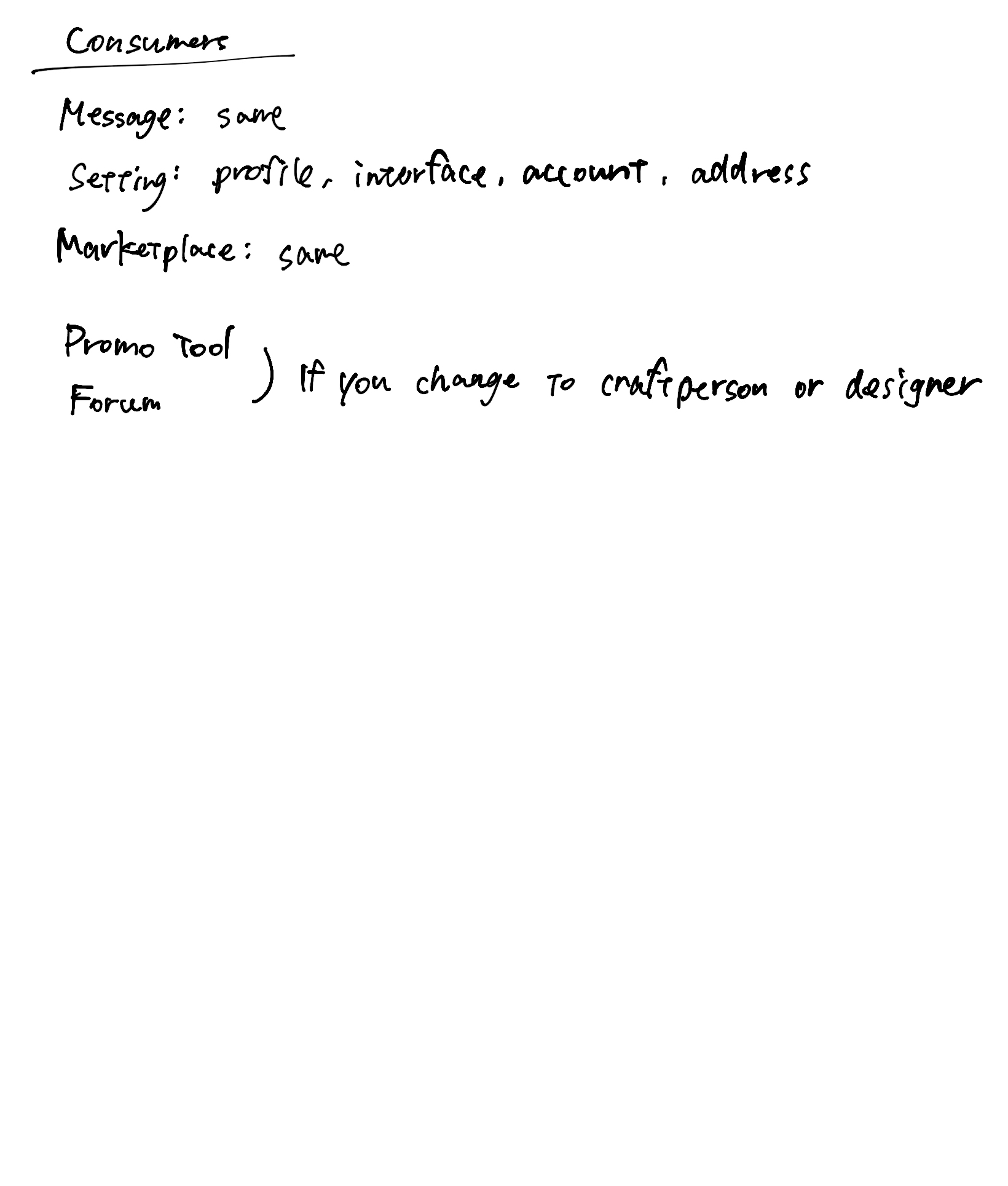
Site map is an effective process to enhance website or App navigation (miro, N/A). It ensures no critical aspects of a App structure, and supports the creation of a better user experience.
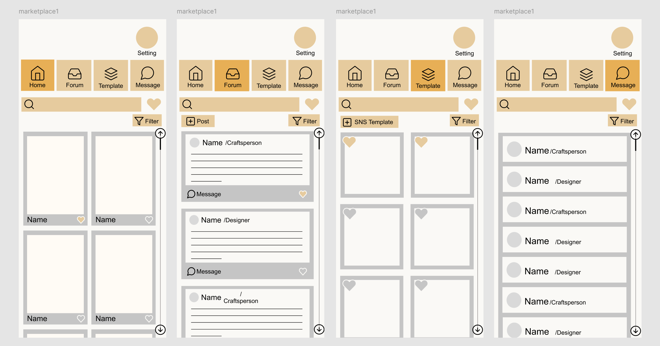
This app has four pages, marketplace, collaboration forum, promotion templates, and massage. Each page functions to this site map.
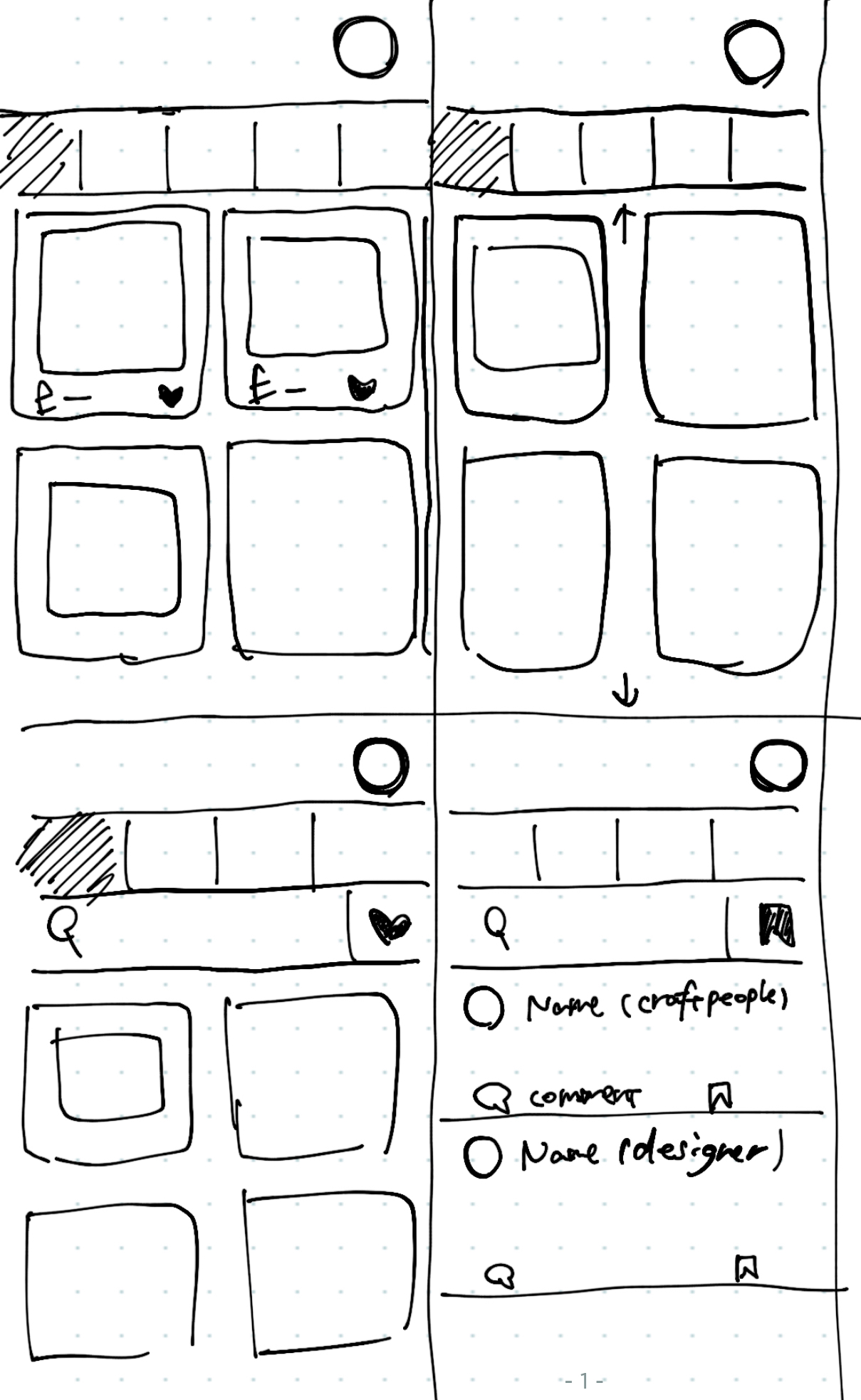
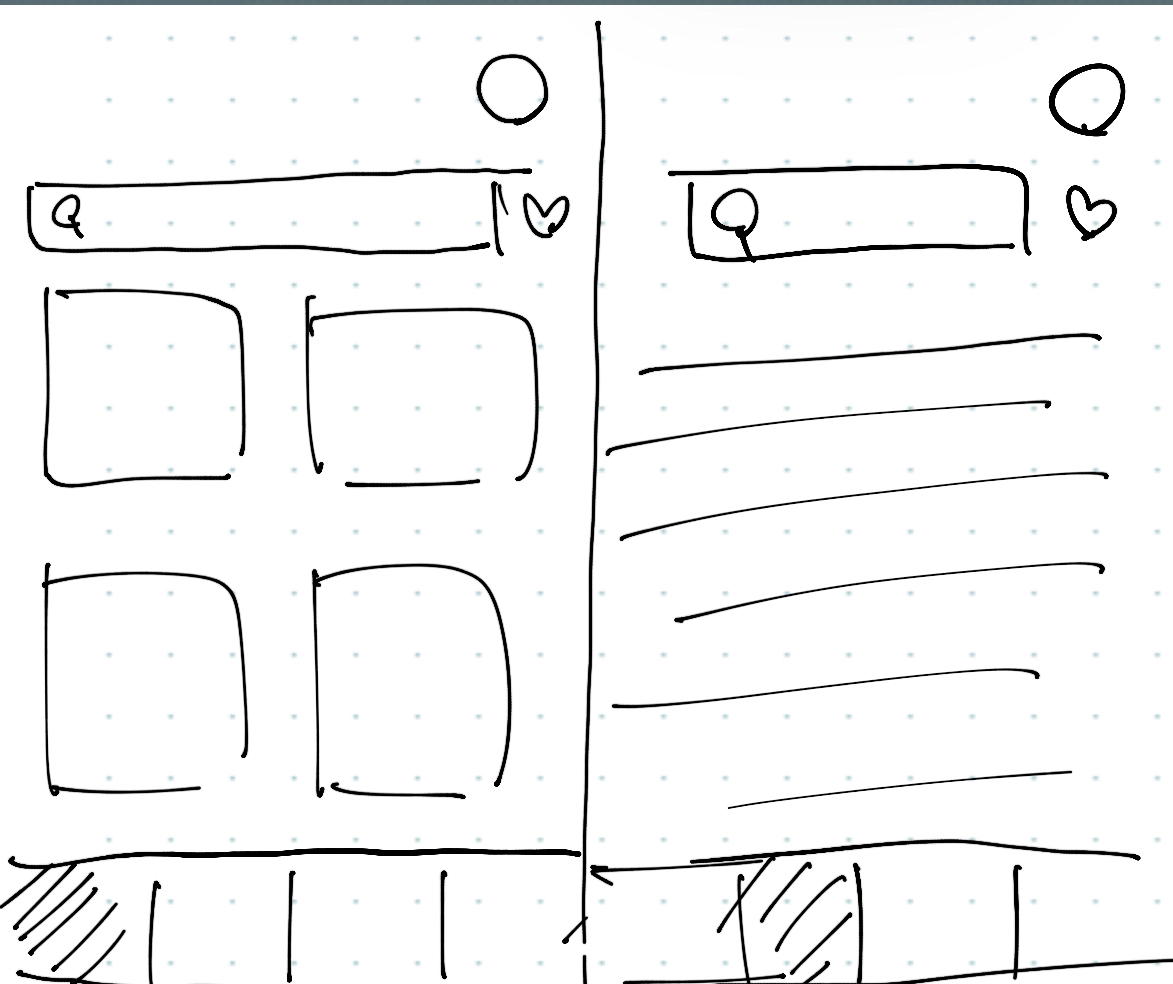
Low-Fidelity Wireframes
High-Fidelity Wireframes
Final Product
Reflection
What Went Well
- Came up with innovation ideas during the process: I came up with practical ideas that can be effectively implemented.
- Gathered indights from conversations with people close to traditional craftsperson: A friend's acquaintance is a traditional craftsperson and their thoughts on it.
- Comprehensive primary research and pratical investigations: I conducted practical investigations based on the research.
Areas of Improvement
- Time management: Without proper scheduling and due to procrastination, I found myself pressed for time.
- Several important considerations in survey: Without analysing the distribution of nationalities, I could not identify country specific trends. / There was limited feedback from the target audience.
Recommendations
- Developing and executing plans using tools like Gantt charts.
- Utilise time effectively and ensure all necessary information is thoroughly reviewed before conducting research.
Conclusion
I feels like everything was rushed, and I was limited in what I could accomplish. Time management has been an ongoing issue for me, but I need to face it properly and work with more time and flexibility.
References
- Adchitects (2024) A guide to interface design for older adults. Available at: https://adchitects.co/blog/guide-to-interface-design-for-older-adults#essential-improvements-for-seniors-designing-for-older-adults [Accessed 02 December 2024].
- CursorUp (N/A) Eye Tracking: The Ultimate Guide for UX & UI Designers. Available at: https://www.cursorup.com/blog/eye-tracking [Accessed 06 December 2024].
- HERITAGE CRAFTS (N/A) THE RED LIST of Endangered Crafts. Available at: https://www.heritagecrafts.org.uk/skills/redlist/ [Accessed 21 November 2024].
- Jolanki, O., Lolich, L., Pirhonen, J., Timonen, V. and Tuominen, K. (2020) “These devices have not been made for older people’s needs” – Older adults’ perceptions of digital technologies in Finland and Ireland. Technology in Society. 62, 3-5. Available at: https://www.sciencedirect.com/science/article/pii/S0160791X19301794 [Accessed 30 November 2024].
- Kasym, M. (2024) How to Make the Older Users Love Your Product: Examples of UX Design for Seniors. Eleken. Available at: https://www.eleken.co/blog-posts/examples-of-ux-design-for-seniors [Accessed 02 December 2024].
- miro (N/A) How to create a site ,ap in 8 steps: Designing a better UX flow. Available at: https://miro.com/blog/how-to-create-a-sitemap/#:~:text=Site%20mapping%20is%20a%20useful,deliver%20a%20better%20user%20experience. [Accessed 09 December 2024].
- Polyuk, S. (N/A) Age Before Beauty – A Guide To Interface Design for Older Adults. Toptal Designers. Available at: https://www.toptal.com/designers/ui/ui-design-for-older-adults [Accessed 02 December 2024].
- The Global Goals (2024) 12 Responsible consumption and Production. Available at: https://www.globalgoals.org/goals/12-responsible-consumption-and-production/ [Accessed 10 December 2024].
Bibliography
- Buck, A. (2024) 15 Best Shopping Apps in 2024. MobiLoud. Available at: https://www.mobiloud.com/blog/best-shopping-apps [Accessed 02 December 2024].
- HERITAGE CRAFTS (N/A) CATEGORIES OF RISK The Heritage Crafts Red List. Available at: https://www.heritagecrafts.org.uk/categories-of-risk/ [Accessed 21 November 2024].
- Nakagawa Masashichi Shoten (2024) What is Bashofu? Airy kimonos born in the fields of Okinawa. Available at: https://story-nakagawa--masashichi-jp.translate.goog/craft_post/118002?_x_tr_sl=auto&_x_tr_tl=en&_x_tr_hl=en-US&_x_tr_pto=wapp [Accessed 29 November 2024].
- Nefertem (2024) GENERATIONAL CRAFTSMANSHIP: WHY SHARING YOUR CRAFT IS THE KEY TO KEEPING ARTISAN TRADITIONS ALIVE. Available at: https://nefertemnaturals.com/blogs/news/generational-craftsmanship-why-sharing-your-craft-is-the-key-to-keeping-artisan-traditions-alive#:~:text=Generational%20craftsmanship%20is%20a%20term,preserving%20cultural%20heritage%20and%20traditions [Accessed 27 November 2024].
- Nippon Kogeido (2024) What are lucky Japanese patterns? What do they mean? 16 traditional Japanese patterns. Available at: https://japanesecrafts-com.translate.goog/blogs/news/luckypattern?srsltid=AfmBOorjThnvdPF04VA-HkurJJwH7PzN4-loJ1SbjdpuEbI5V2tkoju1&_x_tr_sl=auto&_x_tr_tl=en&_x_tr_hl=en [Accessed 28 November 2024].
- THE GLOBAL GOALS (N/A) 12 REAPONSIBLE CONSUMPTION AND PRODUTION. Available at: https://www.globalgoals.org/goals/12-responsible-consumption-and-production/ [Accessed 30 November 2024].
- RSA (2024) RSA SPARK Creativity changes tomorrow. Available at: https://www.thersa.org/design-for-life-our-mission/capabilities-for-life/rsa-spark [Accessed 30 November 2024].
- UNESCO Intangible Cultural Heritage (N/A) Traditional craftsmanship. Available at: https://ich.unesco.org/en/traditional-craftsmanship-00057 [Accessed 27 November 2024].
- United Nations Trade and Development (2024) Creative Economy Outlook 2024. 27-29. Available at: https://unctad.org/publication/creative-economy-outlook-2024 [Accessed 27 November 2024].