Brand Deconstruction
This project was to choose a exist brand that popularity is going down, and rebranding to regain their fame again. I chose Avon in this project.
Avon is a beauty company, established more than 100 years ago. They started with door-to-door selling and moved for women's right. Today, they have a page about women's right in their website and create beauty products for women.
Their target audience are middle-aged women and young people are not interested in their products much. Because of that, the revenue and popularity are declining.
In this project, I mainly redesigned the logo and packaging.
-
These are current logo. This looks really simple and less representation.
-
In 1936, they changed the logo which was with tulip. That logo represented feminine and elegance. I adopted the idea and added the same pink colour.
Those are old logo and my sketch.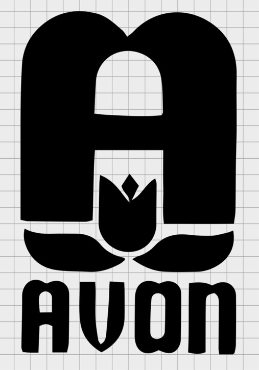

-
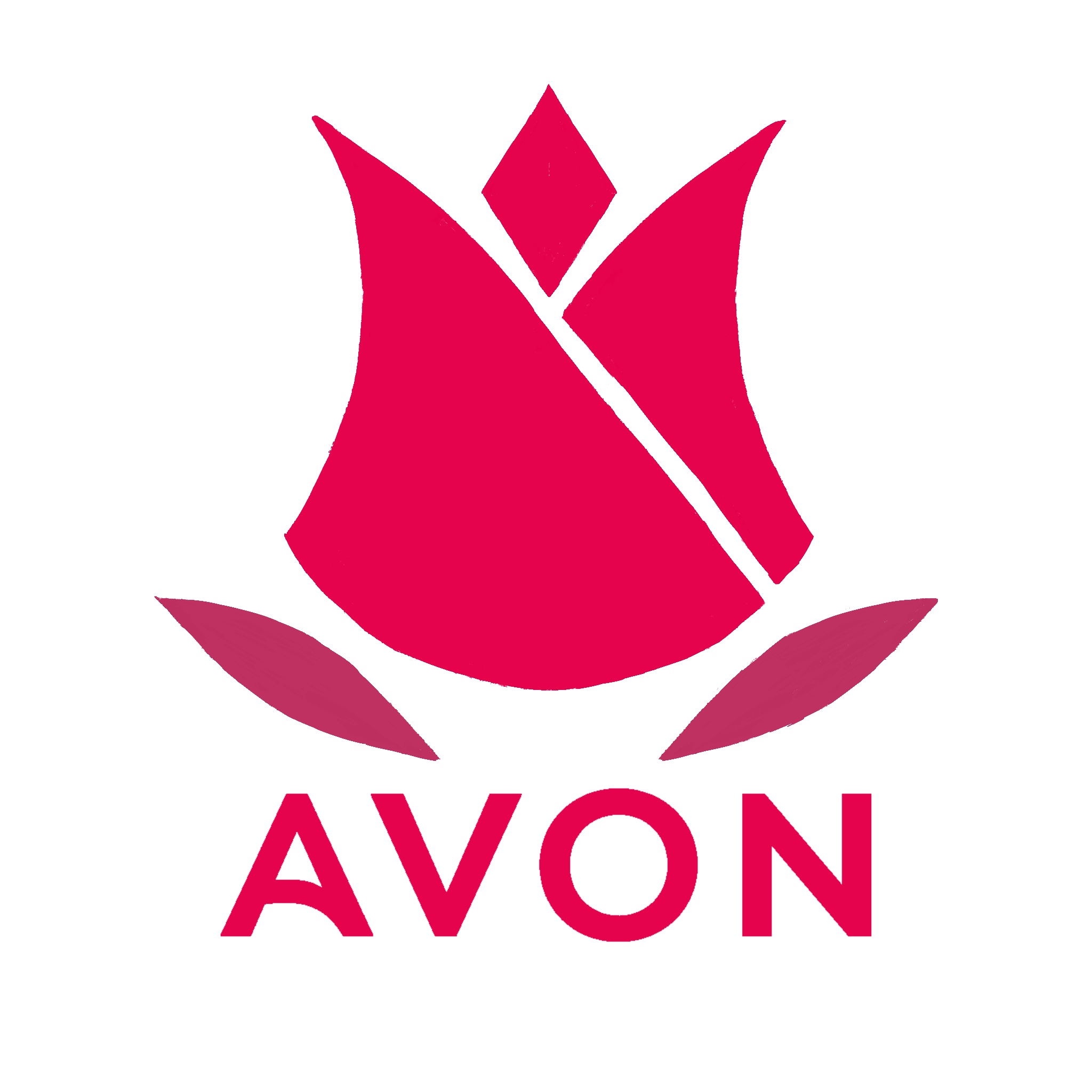
These are the final design of Avon logo.


Here is the new guideline PDF of Avon.