Promotional flyer
My flyer theme was "Tokyo". That is the prefecture in which I was born and the capital of Japan.
My colour image of Tokyo is red or pink. We can see a lot of red at Japanese traditional buildings, for example temples or shrines, and pink is the colour of cherry blossom.
-
1
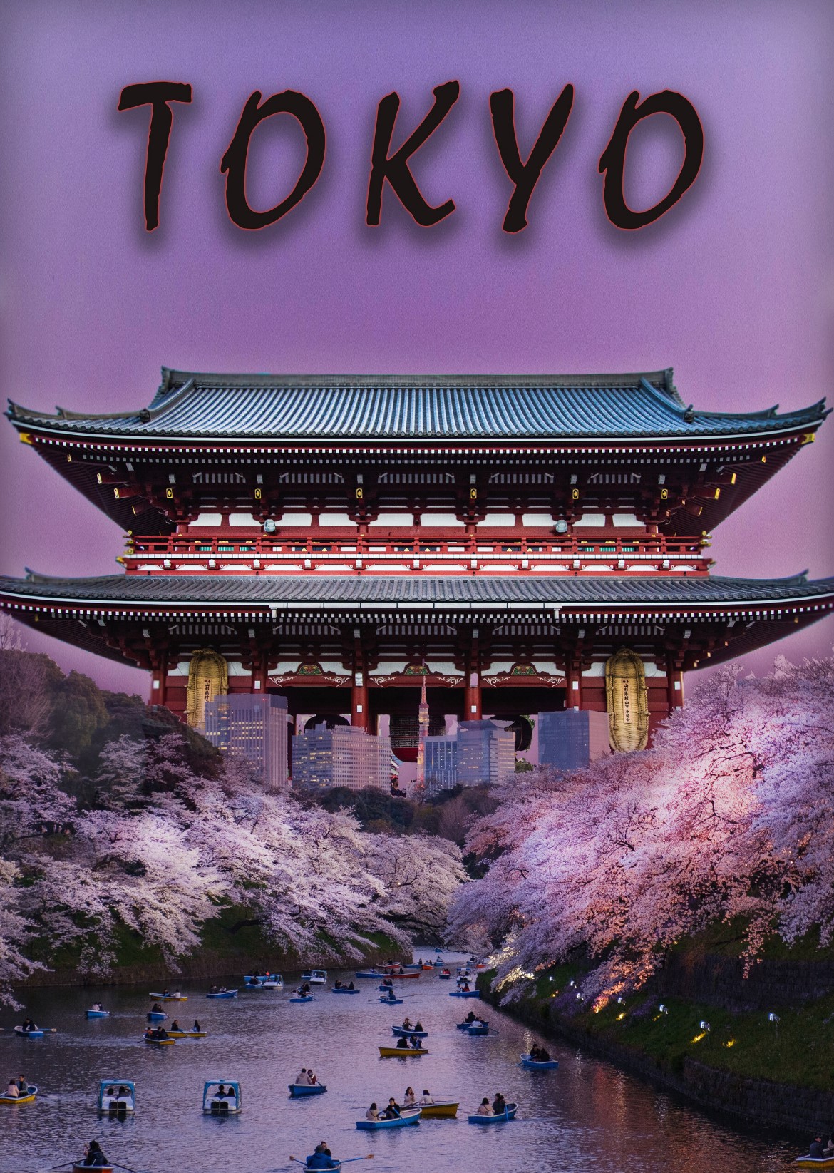
I found and added photos of temple gate and cherry blossom. The flyer had the gradient of purple and pink as colour theme of this. However, it was not developed enough.
-
2

I understood most people won't be able to read Japanese but I added the Japanese character "Tokyo" because this is the part of my culture. The reason was I wanted create Japanese atmosphere. This was important to me because I wanted to show that I am bilingual.
-
3
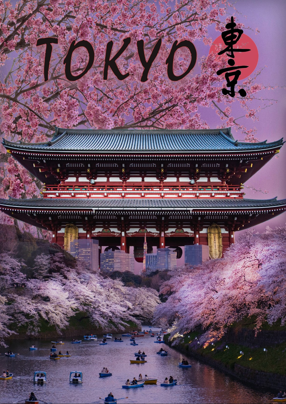
I thought the top of flyer was a little bit empty and bland. Therefore I inserted other cherry blossom there.
-
4
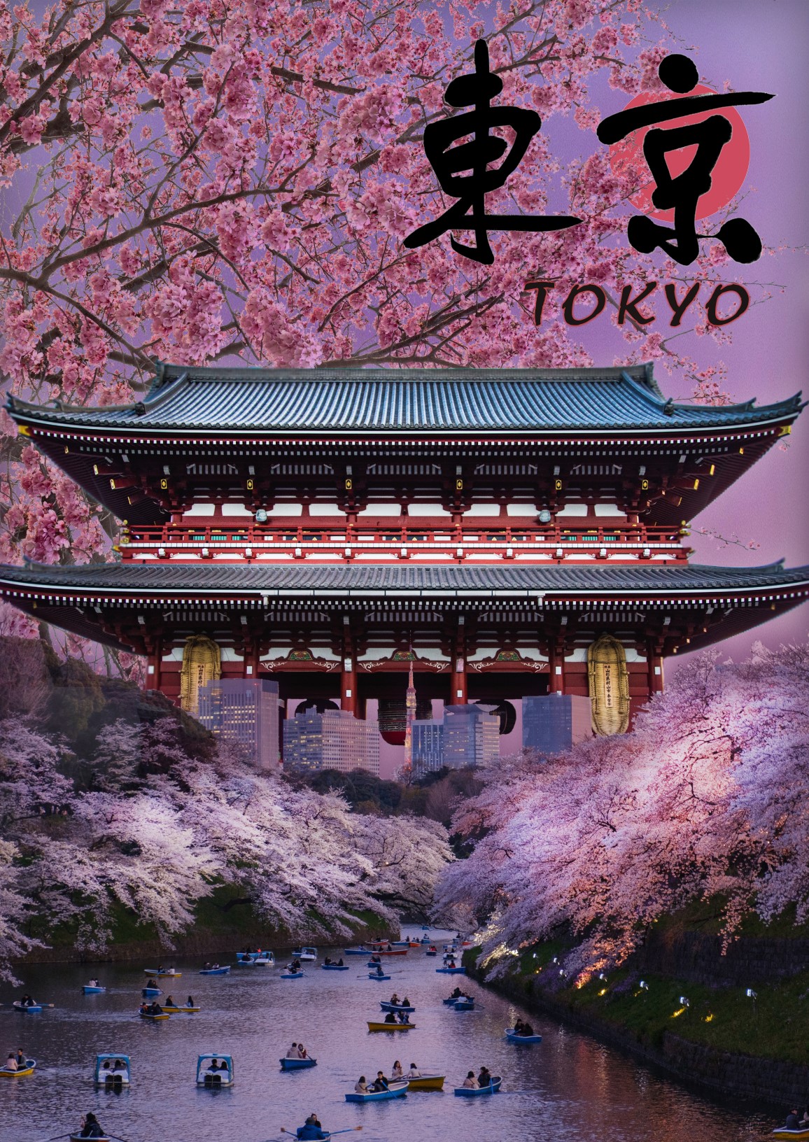
This was the final one. Following my tutor's advice, I made Japanese character bigger. It is promoting "Tokyo" so it made sence that I made it seem like more Japanese.